We were asked to do a Preliminary Task, and for this we were asked to do a continuity film that involved three camera techniques:
* Match on Action shots* Shot/reverse shot* The 180 degree ruleThis is the video we filmed and edited:
http://uk.youtube.com/watch?v=g73aj51gKaUMatch on Action:This is where the camera switches between the characters two perspectives, but not in the sense of an over the shoulder shot, as you can still see the character it is like the audience become voyeurs; for example the audience see the character walking towards the door, and the next shot the character has come through the door.
We used a match on action shot in the beginning of our film, as this is where the shot made the most sense and was the most convenient.
Shot/Reverse Shot:This is used when two characters are looking at each other. The first character is seen to be looking at the second character, and then after the first character has finished looking at the second character the camera then shows the second character looking at the first character. This suggests to the audience that the characters are looking at each other.
This shot was used in our film in the time frame 15 - 20 seconds, where you can see the first character looking at the second character.
180 degree rule:If two people are being filmed from one direction the 180 degree rule can't be broken, because if not the scene makes no sense to the audience. If you want to change the position of the characters on screen, you must show the camera crossing the 180 degree line.
For our film, we decided to do something slightly different with the conversation and have it between a daughter and her mother, however the daughter doesn't know that the woman she is talking to is her actual mother, until the woman tells her.
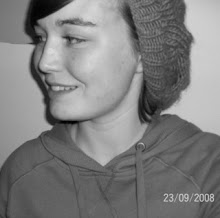
I played the adopted daughter and Emily played her real mother, and Matt filmed. We filmed in the school canteen, however we were thinking of filming in a cafe to make the film more realistic, but many cafe's aren't that happy with people filming in there, and the noise level in the scenes would have been much louder as the cafe would have been busy.
We were also asked to write a script, this made it much easier to film, because we had some idea of what we were going to say.
Script:Characters: Emily- Lauren’s mother
Lauren- Daughter of Emily, adopted by someone else, Emily’s her real mother.
Emily: Hello
Lauren: Hey
Emily: [nervous] I got you a drink…
Lauren: Oh thanks, what did you want to talk to me about?
Emily: [nervous, faltering] Well, this isn’t easy for me…
Lauren: I don’t have long, I’m meeting mum in about 20minutes.
Emily: [exasperated] she’s not your mother! I am!
[Cut]
Analysis of Sequence:
The sequence involves the first character walking through a door, using a match on action shot
. As the first character and the second character are engaged in conversation, we have used a shot/reverse shot in order to show the audience who the characters are talking to. During the entire conversation we followed the 180 degree rule in order to avoid confusion. The set up of the sequence and the speed in which we completed it was helped due to the simplistic nature of idea; a conversation between two people in a "cafe." The simple nature also helped make the sequence effective and belivable.
Technology/Equipment:
We used a varied range of equipment and technology; video camera, tape, tripod, Adobe Premier Elements. After we had completed the filming we transferred the raw footage over via a Firewire Cable onto our media computers hard drive and used Premier Elements to edit the footage into a more sequential and enjoyable video.
Editing (Premier Elements):
In order to edit our video we used the schools editing suite and the software that is on the computers, Premier Elements. We used Premier Elements in order to separate the best parts of the footage from the unwanted parts; the software also made it easier to have smoother transitions between takes, i.e fade to black; we were also able to add a title sequence to the beginning to give the audience some idea of what the film is about; it also provides information to the examiners as to the length of the film and our candidate information. We were also able keep some footage, that wasn't wanted in the main sequence, but made some funny outtakes without transitions making the cut between shots quick and more amusing.
Once the editing was completed we exported the film into standard computer format (.avi) and then had to upload it to www.youtube.com in order to make it more accessible to examiners and teachers. The link for our video is at the start of the post.
Overall the filming and the editing went well and was effective. Even though we covered all the shots that we required in the brief, we only had one of each shot during our film, rather than varying the amount of the different shots. Throughout the filming, our camera skills weren't vastly improved, this is partly due to the fact that only one person could film at any one time, therefore the two characters in the film had no chance to use the camera because they were being filmed, however this was able to be corrected during our Thriller filming as two different people played characters and there was only one scene where the two characters were in the frame together. We did, however, gain an improved knowledge of Premier Elements and we can use this knowledge to make the transitions and the composition of our thriller alot better. Another thing that we considered during this filming and that we put into practice for our thriller was using the tripod more in order to make the filming more steady; the unsteadiness in certain parts of the footage became more apparent during editing due to the larger resolution.
We managed to complete the task, considering in the beginning our limited knowledge with the camera and the editing equipment, and managed to improve our skills using the camera and Premier Elements that we can take through and use in our Thriller editing/filming and for future videos.


 This perfume gives the sense that you can with in touch with nature, and you can be yourself, in your natural state, you dont have to change and be someone different.
  I used this bottle, as it was in keeping with the colour scheme (purple and green) and the flowers/leaves are in keeping with the nature feel of the advert. The rounded shape of the lid and the bottle, give a feminine, gentle feel.
 The use of purple flowers were because of the colour scheme and because flowers are a large part of nature. Also purple is a feminine colour which suggests that this is a feminine perfume, it is also a bold colour, which also suggests that you can be feminine and strong, obvious, and noticeable.
 I decided to have ivy in the corners of my advert to show that if you wear this perfume you have a slightly wild side, that is tamable. Also the green again is part of the colour scheme, it is also considered as a masculine colour, which contradicts the femininity of the advert, however it shows that you can be feminine wearing this perfume, but you can also have male positions in the work place and can make "male" decisions.